Call Center CRM
Spearheading a user-centered culture shift as a UX team of one
UX Designer
A major utility service provider
5 weeks
The background
While working in the technology consulting world, sometimes I faced people and project problems more than design problems. In this case, I was brought on for only 5 weeks as a solo UX designer to help facilitate product roadmap workshops and make design recommendations for a Salesforce application used by the call center for a large Midwest utility service provider.
It was quickly evident that my role was considered a “nice to have” addition, serving mainly to make the product more “pretty.” The manager of my own team had never heard of user experience, let alone worked with a UX designer before. The UX scope per the contract with the client consisted of two short, vaguely worded bullets.
At this juncture, I could have opted to simply fulfill loose expectations: conduct the workshops, mockup a few designs, pass them off to be added to the product roadmap (to be implemented or not), and move on. The product itself was split across three disjointed workstreams and had no sense of consistency, in design or leadership. There was no evidence that users had ever been consulted when the product concept was first introduced. The client wanted a human-centered approach, but historically, the only “humans” they considered were customers. Past research efforts had left the actual users of the product in question—their employees—behind. I wanted to help guide them to take a more inclusive approach, and to adopt a scalable design strategy.
Goal setting when the ask is unclear
Despite the limited timeframe and vague expectations, I wanted my contribution to have long term impact. I decided to give myself three goals for the end of the five weeks:
Conduct the workshops and wireframe priority design updates. (The baseline expectation)
Take any chance I could to sit down one-on-one with users to develop a better understanding of existing pain points.
Galvanize the team around embracing a scalable design system to address the deteriorating design consistency issues.
Revealing the voice of the user
I wanted to leverage my early time on the project to better understand users. I communicated this intent to the client contact, who connected me to a manager at the call center who could schedule one-on-one time with individual customer service representatives (CSRs) using the product.
First, I knew I would need a more granular understanding of user roles. I requested time with a broad cross-section of CSRs to span different jurisdictions (across two states), segments (residential, business), channels (phones, live chat, social media), and levels (representatives, managers).
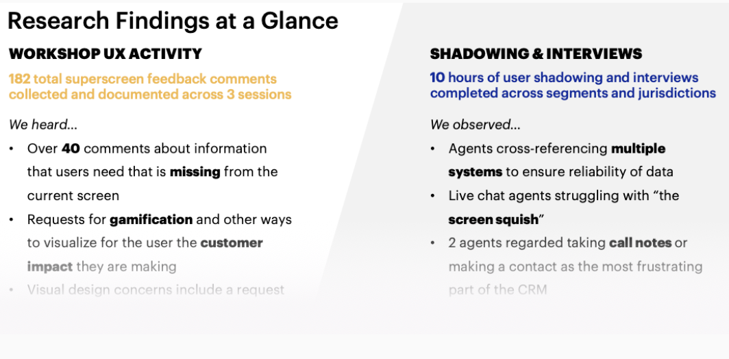
Over the course of the first two weeks, I would sit down with 10 different users and observe over 50 customer interactions.
As I started to amass raw notes from the shadowing and interviews, I transcribed them and my initial insights into a spreadsheet that I shared across the broad product team. This caught the attention of key client stakeholders, my manager, and the managing director overseeing the client account, all of whom were excited about the buzz the insights were generating. Product owners (all client employees) across all three product workstreams began stopping by my desk seeking advice and asking questions. By the end of the five weeks, the team was beginning to speak in the voice of the user.
Building consensus
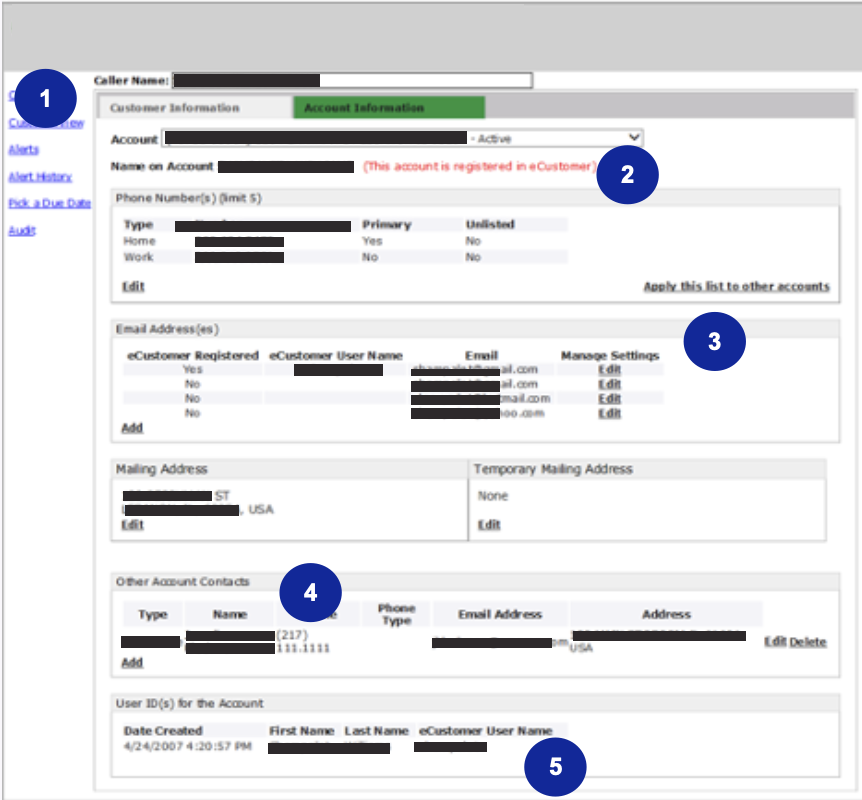
Typically, Salesforce products already have a consistent look and feel thanks to the robust enterprise Salesforce Lightning Design System. When problems arise, custom components are the usual culprit. Custom components should always be executed judiciously because they are notoriously difficult to maintain during system updates and increase development time. In this case, there was no return on that investment; instead, the product was becoming visually bifurcated. When I first came on board, I learned that developers were actually spending time customizing native Salesforce components to look less like Lightning so they better matched the custom components—except the custom components didn’t even match each other.
The root problem driving the inconsistency was a lack commitment to a unified design system. The disheveled UI and interaction patterns were symptoms of that larger problem.
I knew the client wanted to improve the product’s look and feel, and that visual design was important enough to warrant bringing me onto the team.
I knew establishing a consistent, scalable design system would be a long-term UX win and allow product teams to spend more time focused on serving users and customers, and less time fussing with individual pixels.
But no matter what, I knew there was no way to broach overhauling the visual design without a considerable amount of rework on the product. I would need the buy-in and support from my manager and senior leads across the team.
I started conversations early and diplomatically to address the issue and to make sure the team was aligned on a long-term strategy that would serve as the foundation for my later wireframing. Together, we agreed the best option in this case would be to utilize the Lightning Design System (LDS), and that custom components should be redesigned to match the LDS look and feel, rather than the other way around.
Introducing usability concepts
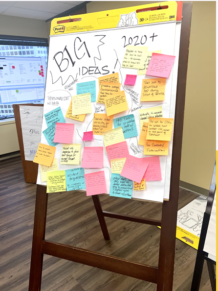
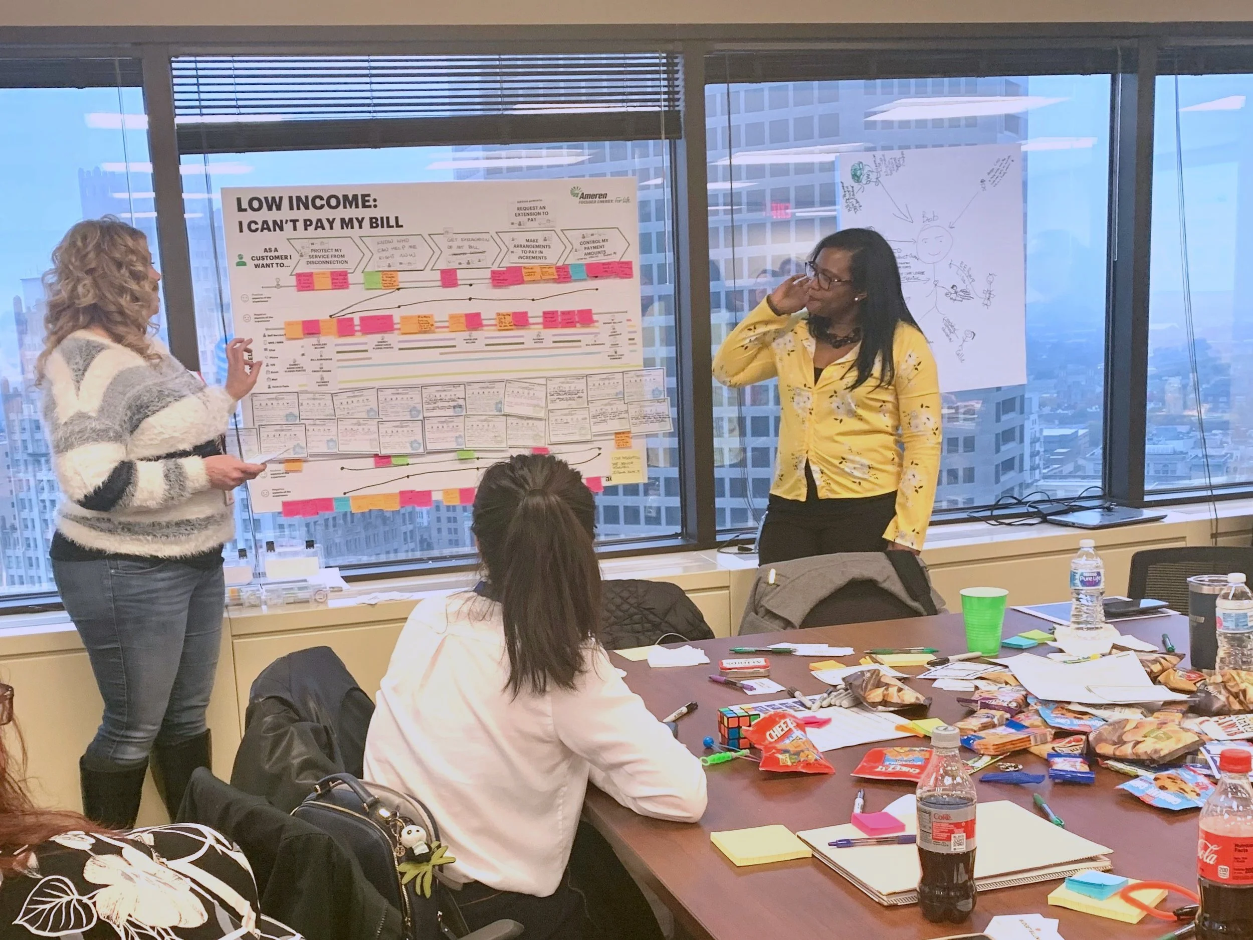
The workshops, planned for weeks 3 and 4, would break down into 4 full day sessions and involve over 80 users and stakeholders. While I did not have jurisdiction over the workshop agendas, I collaborated with my manager and team to encourage more user goals and pain points to come forward, a break from the default setting of focusing solely on the customer. A journey mapping exercise, after a few friendly nudges from me, included parallel lines for both the customer’s and the user’s experience. Progress!
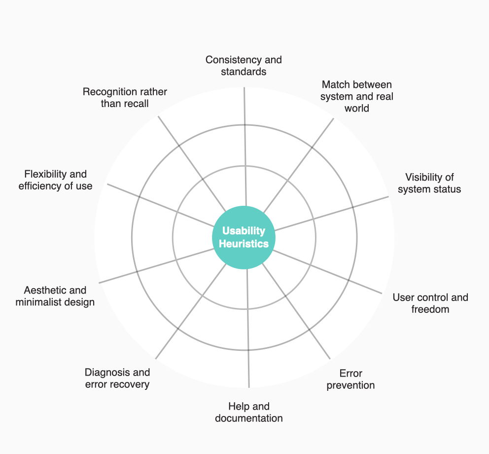
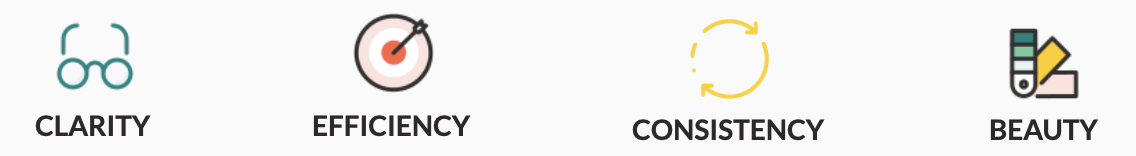
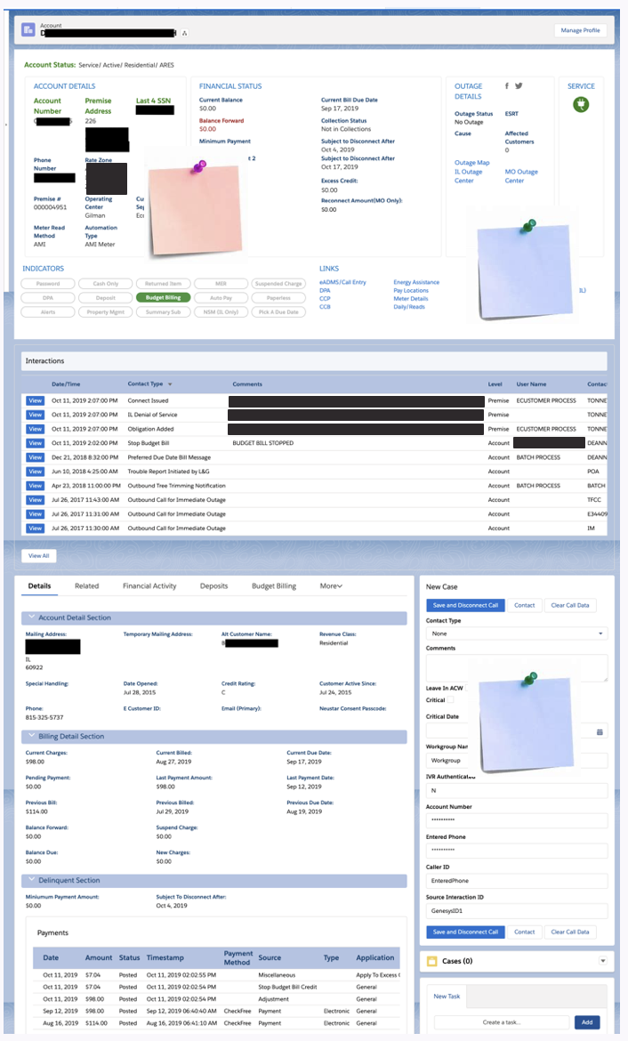
For the UX workshop activity, I wanted to bring the focus back to the product itself, since much of the rest of agenda would be spent zoomed further out. In past projects, I have found heuristics to be an accessible way to introduce lay people to usability concepts. I decided to I would introduce five of the ten tried and true Neilsen Norman Group heuristics, and work with participants to evaluate the most commonly used product screen—a customer record page—utilizing a giant print out and post-its, breaking into small groups of 5-8 people.
Facilitation
The activity landed well with participants. I briefly introduced the selected usability heuristics including Match between system and real world, Consistency and standards, Recognition rather than recall, Flexibility and efficiency of use, and Aesthetic and minimalist design. I then asked participants to consider the following questions while reviewing the screen in small groups:
Is any crucial information missing or hard to find?
Is all of the information on the screen relevant to you?
Is information grouped or listed in the order of your customer journey?
Does the language on the screen match how you talk about it with the customer?
How might we lower the learning curve?
Findings
By the end of four workshops, over 180 individual pieces of feedback were collected. This feedback included some common tropes that I expected (“too much white space!”) but many of the notes supported the hypotheses I had coming out of shadowing and interviewing users, and flagged some additional new product issues that were not on my radar. Participants pointed out acronyms that no one understood, duplicated information at the top and bottom of the screen, and several instances where important information was missing.
Finding insights
I turned back to my user interview spreadsheet with my newly gathered heuristic feedback. Unfortunately, there was neither time nor resources to complete a collaborative analysis session with the team, so I opted for a digital process which I had used in the past in time-crunch situations.
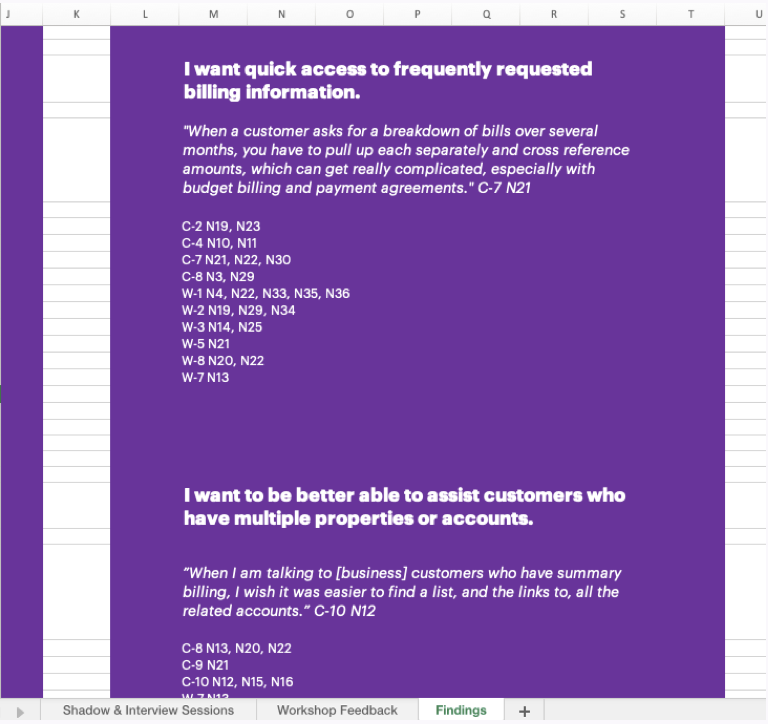
In the same spreadsheet, I added a new sheet for the workshop heuristic feedback. I then started flagging the notes and feedback by key terms, topics, and related customer journeys in a separate column. These would directly inform the findings later highlighted in the UX readout.
This one master file would serve as a single source of truth, documenting the voice of the user across the two unique contexts. A final list of UX findings (later distilled into “themes”) were supported by tracking related raw notes or feedback with an ID number, linking everything to its qualitative source to ensure the voice of the user was retained and trackable.
Sketching and wireframing
Armed with research insights and having built consensus around the Lightning Design System (LDS), I started sketching and wireframing.
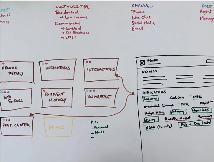
In order to propose the best solutions, I needed to better understand the relationships between the data I was seeing on the screen, the platform architecture, and real user needs. My first step was roughly mapping all of the pieces to ensure I had a solid grasp of the product ecosystem. I knew this was especially important if I wanted to address the numerous pain points that centered around the density of data. Leveraging these details, I could develop a case for how enhancements to user personalization could eliminate a lot of unnecessary cognitive load on the current screens.
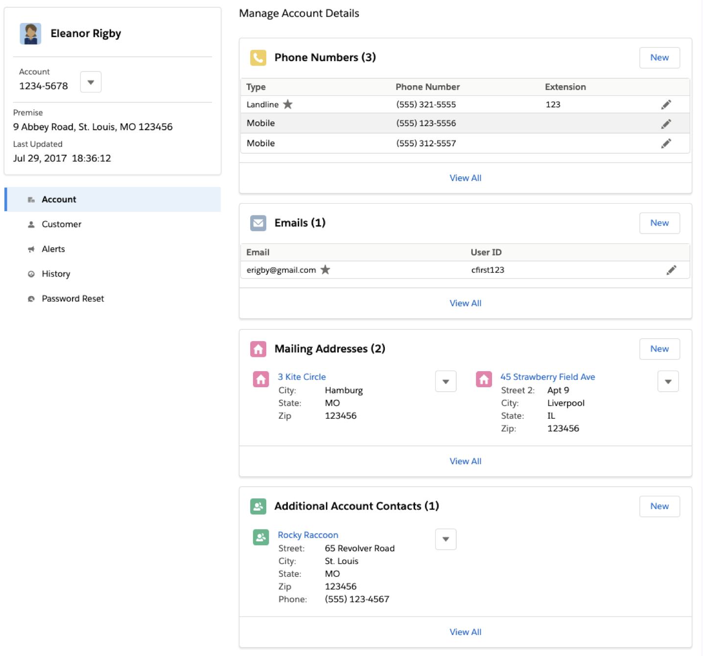
Then I iterated on priority features and modules identified by my research findings, stakeholder input, and customer call metrics. Rather than unload all my ideas with a thud in my final deliverable, I synced regularly with team members to test and refine my ideas, eventually polishing some key screens and concepts into high fidelity mockups.
Consolidating recommendations
As my time on the project drew to a close, I worked to consolidate my findings, wireframes, and recommendations into a readout deck that was cohesive with the broader product roadmapping outputs. I paved the road for a more research-driven, user-centered approach moving forward by summarizing the high points and formally documenting decisions that had been discussed over the course of the engagement.
Strategic opportunities
I distilled the most prevalent strategic findings into pithy “UX themes” for better traction and memorability: The Big Picture, Proactive Next Steps, Simplified Billing, Account Hierarchy, Personalization, and Fast Track to Impact. While these themes were informed by real data, it was important the client understood that this research was not a “one-and-done” effort: our samples were limited by what time and resources allowed. To help make my case, I supported each theme with direct quotes from users.
Each UX theme was correlated with strategic product opportunities that would better serve users and customers alike, including high-fidelity, LDS-enabled wireframes showcasing real-life use cases that surfaced during the research.
I brainstormed, vetted, and further refined all opportunities in collaboration with the technical team to ensure feasibility and document any assumptions, risks, and dependencies.
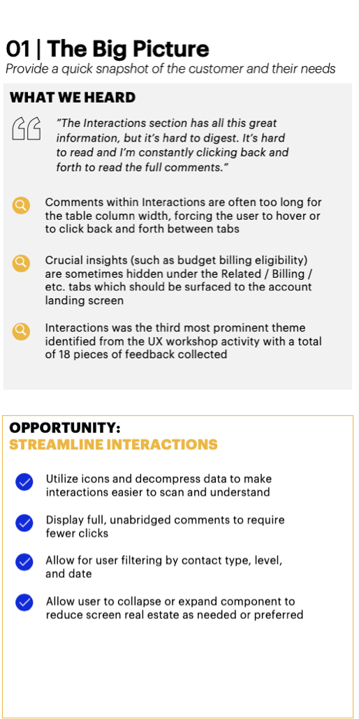
Some opportunities, like streamlining interactions, centered around a shift from custom UI to native LDS UI and interaction patterns. This would eliminate the need to click back and forth to get a full 360 view of the customer at a glance. For other opportunities, such as leveraging account tree functionality, I flagged the dependency of restructuring the current flat data model to enable agents to more efficiently assist business customers with multiple accounts and properties, another prevalent pain point.
Tactical quick wins
I also annotated a number of screens and flows to identify quick wins that would not require significant development effort or deviation from the current sprint priorities. I joined workstream product team meetings to share my findings and called out simple changes—such as clarifying acronyms, reordering components, and using more consistent language—that could have a significant impact.
I continued to cite the voice of the user to better make my case. This came in handy in disproving some assumptions of user mental models. Product team members were surprised to learn that even expert users struggled to make sense of some acronyms on record pages.
Envisioning the future
Finally, I worked with the team to produce a product roadmap and additional scope of work that included staffing a UX resource for a sustained role on the project. I outlined next steps including better definition of user personas to drive personalization enhancements and reserved formal time for UX discovery for high value, complex new features.
The roadmap also included a transition plan to the Lightning Design System, accompanied by high-fidelity wireframes of select product screens to help stakeholders envision and value the updated look and feel.
An improved customer and user experience ✨
I was thrilled with what I was able to achieve in just five weeks:
Educated and aligned team members and stakeholders around a strategy to transition to a design system.
Demonstrated the value of user research by allowing the voice of the user to help drive product decisions.
Led a culture shift to embrace human-centered methodology including both customers and users .
The client, as it turned out, was pretty thrilled too. The new scope of work I helped to define—including UX as a new, long-term pillar of the team—was quickly and enthusiastically signed!