

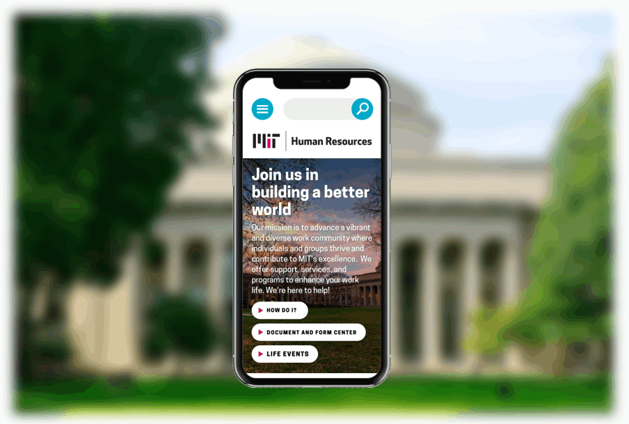
MIT Human Resources Website
Redesigning a Human Resources hub for employees and job candidates
UX Lead
Massachusetts Institute of Technology
14 months
The background
Massachusetts Institute of Technology’s Human Resources partnered with Sametz Blackstone Associates to redesign its website as part of a soup to nuts brand strategy initiative, aiming to better serve existing employees and attract (and keep!) more talent. MIT is a famously decentralized institution, and its Human Resources web presence was no different: it had fragmented into three disjointed sites over the years, and these sites were so information dense and duplicative that they had become difficult to read and navigate, let alone maintain.
Key challenges
My manager departed shortly into the project and was never replaced so I ultimately owned the client relationship and led the team on top of the day-to-day production work.
The vast amount of content that needed wrangling was not accurately captured by the original proposal, leaving the door open for timeline and scope creep.
Close collaboration with teammates less expert with responsive design for web was required to ensure new visual design system was user-friendly, feasible, and scalable for web.
Meeting the needs of diverse user groups—employees (including new joiners, retirees, managers, etc.) and job candidates—in one streamlined experience.
We began by immersing ourselves in MIT, interviewing over 100 representative users and stakeholders, including institutional leadership, individually and in small in-person focus groups, across both brand and web discovery phases.
In parallel, I conducted a competitive analysis across 12 competitor websites to understand benchmarks across both competing universities and top Boston area employers.
We also reviewed other relevant materials including:
Google analytics / web traffic and content inventory for all three sites
New hire survey data
Exit interview data
Job descriptions and requisition breakdown
All feedback about the original websites consistently echoed a central pain point: people were not finding what they were looking for. Not because the information wasn’t there, but because there was simply too much information there.
“Why does HR have all these websites? When I first started I got really confused. I would go looking for something and find different answers in different places.”
— New Joiner
“Too many words, not enough information.”
— Department Head
Strategic requirements
Following our analysis, we aligned with our MIT stakeholders on strategic requirements that would inform our solution, including:
Bring focus to users and tasks, and away from outdated departmental silos.
The original website navigation seemed to be driven by the HR org chart, rather than actual user goals. Key frequently sought information was buried, sometimes under several layers.
Meet users where they are coming from.
Visitors often don’t enter the site from the homepage. Every page is a potential “landing page” and must work towards achieving both tactical user and brand-building objectives.
Elevate the visibility of benefits.
The benefits were a major (if not the main) reason people cited when asked why they work at MIT, and yet many people weren’t aware of all of the benefits available to them. We knew we needed to provide ways for visitors find useful information they weren’t necessarily looking for.
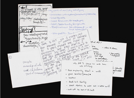
We asked employees to write their response to “why work at MIT?” on index cards as part of in-person brand strategy discovery interviews.
Information architecture
Wanting to take as much of a content-first approach as possible, the first iterations of the redesign were focused around building a solid information framework that mapped to the mental models of our diverse set of target users.
I began with a thorough evaluation of the thousands of pages across all three sites, taking note of duplicated and outdated content. Ultimately, working closely with the primary client contact, we whittled down the core content to be migrated down to ~200 pages. I used this list, as well as our documentation of core user goals and tasks and competitive analysis inspiration from discovery, and to define our first pass at a high-level navigation structure.
Validation
We partnered with MIT’s Usability and Accessibility team to validate our proposed information architecture using the Optimal Workshop Treejack survey tool, which tests navigation and labeling by asking participants to complete key tasks using a straw sitemap. We identified nine tasks cutting across user types, including both common tasks (like updating benefits) as well as unique tasks (like submitting a complaint).
A total of 197 participants from across user groups completed the survey, providing us with invaluable insights into what was working well, and what wasn’t working at all—for example, Career Development as its own section. A staggering 79% of participants failed to find Career Development, the vast majority clicking into Careers rather than the correct section (which at the time, was its own top-level section). Ultimately we moved Career Development into a subsection under Careers, and redesigned the section to serve both current and prospective employee audiences.
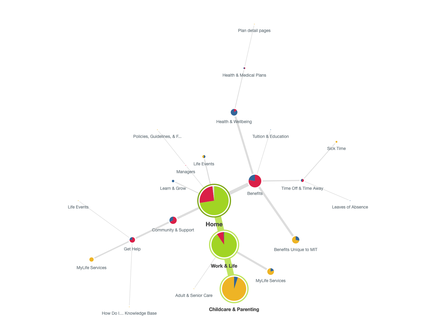
Optimal Workshop piecharts mapped and analyzed every clickpath across 197 participants (green indicates the correct path, red the incorrect path, blue that the user turned around, and yellow was nominated by the user as the answer).
High-level sitemap
The final top-level navigation consisted of four main sections, a secondary audience-based navigation, and utility navigation for important index pages. We took note of important cross-links across sections where we saw multiple primary paths surface during testing.
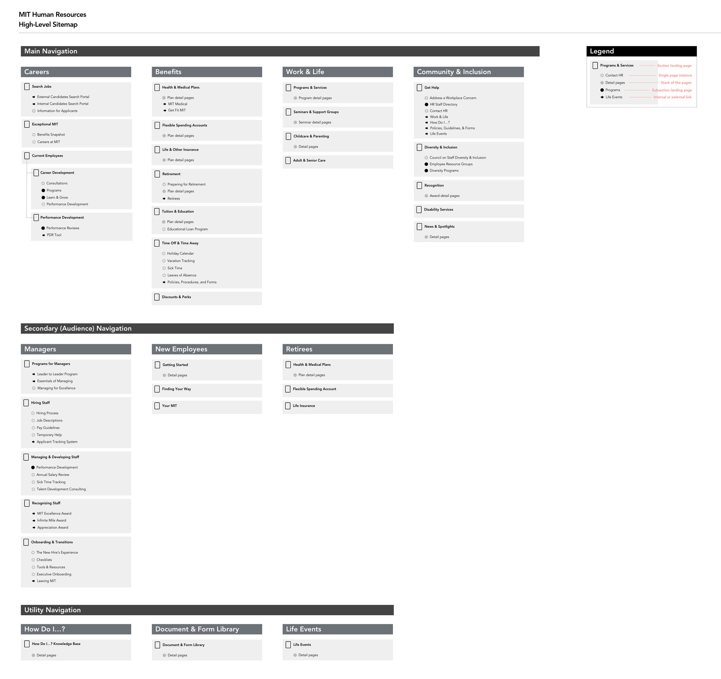
A high-level sitemap captured the top 2-3 levels of the site architecture, while a Google spreadsheet was used to track and organize all content page by page.
Wireframes
Creating wireframes of various levels of fidelity was critical to the progression of the project. Each content type was first created and presented to the client as a wireframe, and iterated over frequently. Through the wireframes, we could outline and visually represent strategic goals and complex concepts to diverse stakeholders. The wireframes became a cornerstone of communication, empowering the client to be valuable partners in the redesign process.
Working again with the MIT Usability team, I coordinated remote unmoderated usability tests with over 90 representative users on Loop11 using the wireframes to identify user pain points. With the team, I iterated through page layouts and user journeys, presenting and workshopping options frequently.
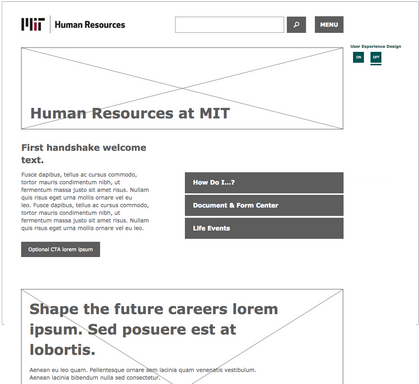
Final wireframes were assembled into a clickable prototype ~25 pages deep to document functionality, micro-copy suggestions and content strategy principles, and taxonomy implementation.
Scalable, accessible design system
I worked closely with my design colleagues to develop a brand new (pun intended) visual design system consistent with the outcomes of our brand strategy engagement that would be scalable into the future and meet accessibility requirements.
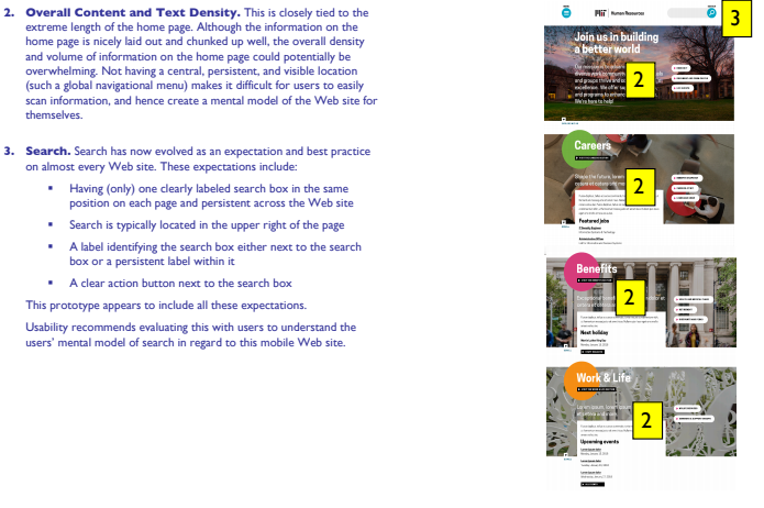
Again partnering with the MIT Usability team, we incorporated accessibility feedback into design iterations.
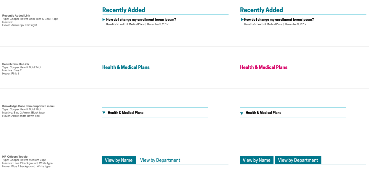
I worked with design colleagues to develop a thorough style guide and ensure consistent application of states and usability patterns.
Documentation
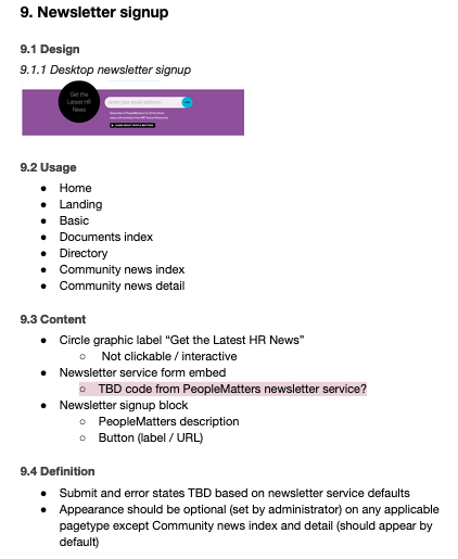
To avoid future IA pitfalls, we worked to define a solid and flexible set of content types and components that would serve as the foundation for the customized CMS.
I worked hand in hand with developers to establish and spec content types, components, and their variants, monitoring them continuously over the project's duration. Each content template was annotated and then spec’ed to document which module would be used where. This documentation assisted developers and content authors, and ensured alignment across the team.
I led creation of the functional specification documentation to ensure a smooth development handoff.
Our team’s efforts created a positive employee and candidate experience that has increased findability, scannability, and improved content hierarchy. The redesigned site allows MIT employees to find relevant information faster, and the MIT Human Resources web team to maintain that content more easily.
“This is a whole different product than the old site. So much more than just a badly-needed look and feel upgrade... All the features and things it can do make our work lives easier.”
— HR Web Manager, MIT