

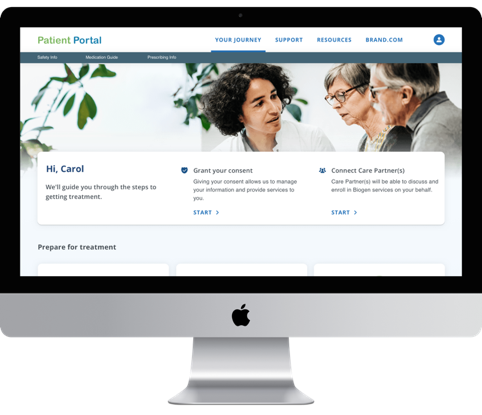
Patient Portal
Enabling digital treatment support for patients experiencing memory loss
UX Designer & Research Lead
A major pharmaceutical company
8 months
The background
Our client, a major pharmaceutical company, needed to create a digital self-service experience for patients and caregivers—fast, and from the ground up.
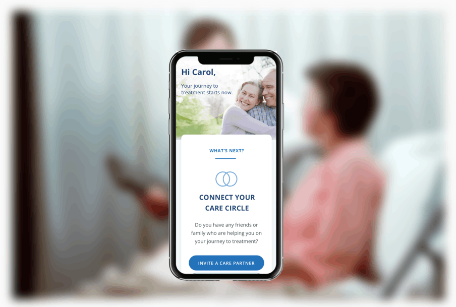
With the release of a breakthrough treatment for Alzheimer’s Disease and Mild Cognitive Impairment on the horizon, our client, a major pharmaceutical company, partnered with Accenture to create a digital patient portal. The business objectives were clear: enable the client to meet high anticipated demand, onboard patients efficiently, and reduce call center workload, all while also building trust and demonstrating genuine care and empathy for patients.
Key challenges
An exceptionally accelerated timeline dictated by the release schedule.
An approval process weighed down by complex legal and regulatory requirements.
Poor visibility into dependencies owned and being produced in parallel by other vendors, including marketing/branding.
Meeting the needs of key users experiencing memory loss and less savvy with technology.
Creating a framework that would be able to scale for additional therapies in the future.
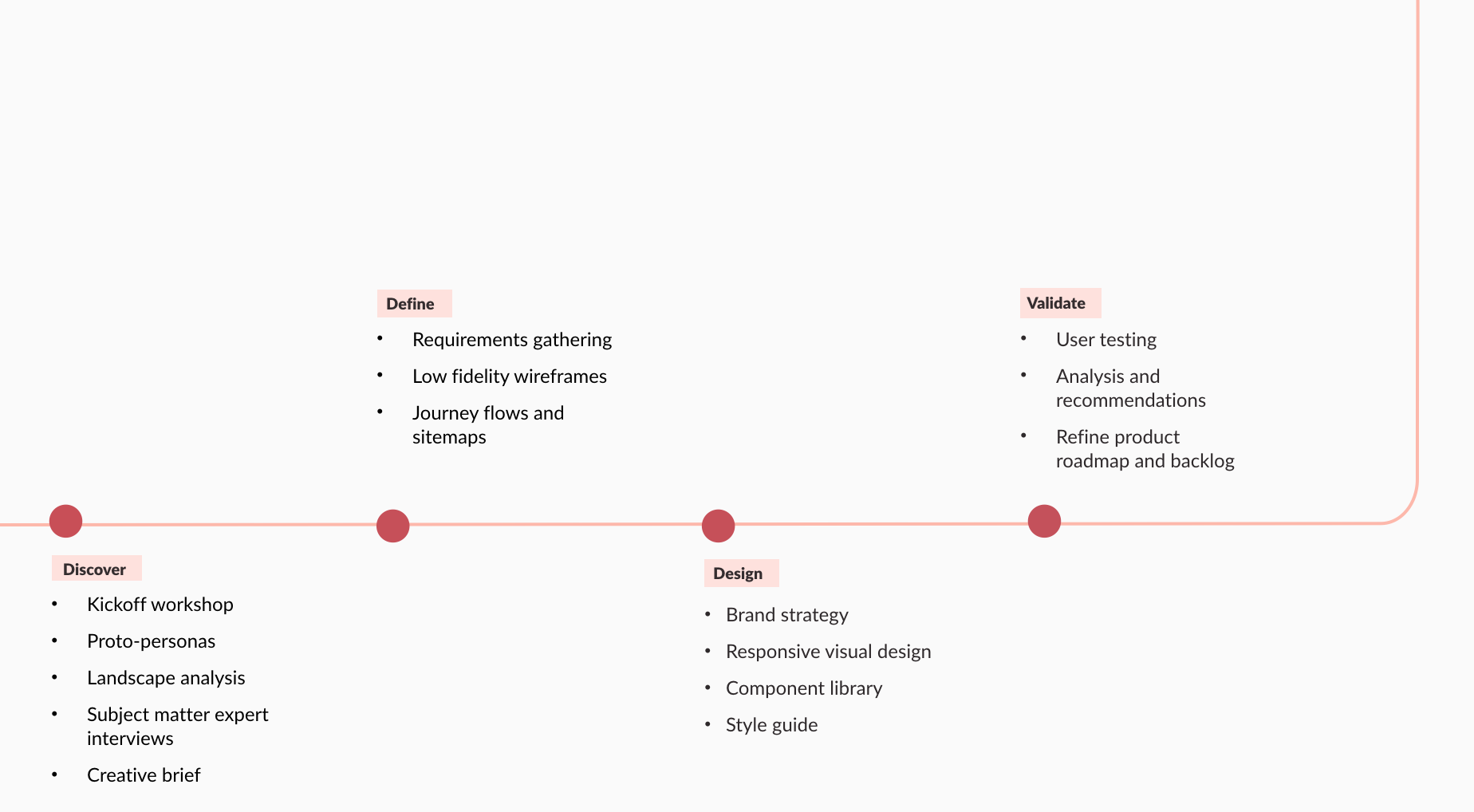
End-to-end approach
How might we envision the digital experience to help patients and caregivers manage treatment and stay informed?
From the very beginning, we collaborated closely with the client, continuously learning interdepartmental requirements and understanding technical constraints.
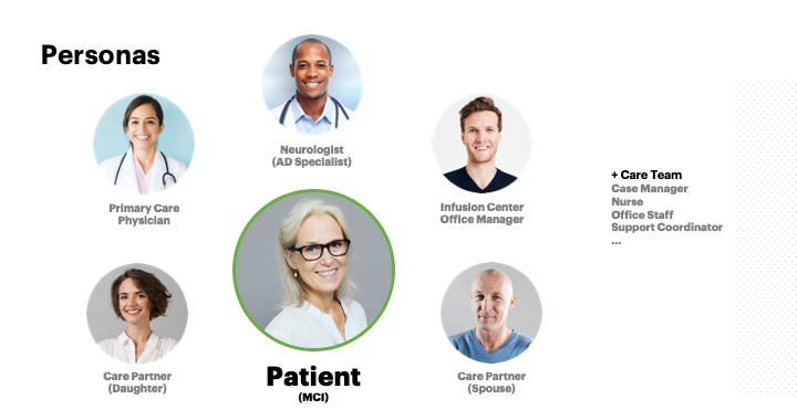
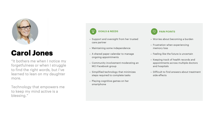
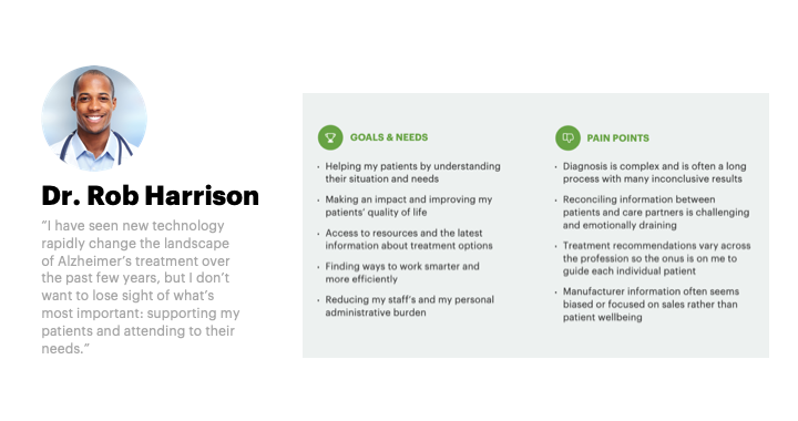
We conducted subject matter expert interviews and an in-depth landscape analysis, benchmarking best practices across other digital patient experiences. We also carefully analyzed business objectives, known challenges, and relevant market research, developing proto-personas based on existing materials .
In a kickoff design thinking workshop with key stakeholders, we ideated on the ideal user experience with key stakeholders, exploring the art of the possible. Finally, we aligned on scope a high-level feature set that would support business and user goals for initial product launch.
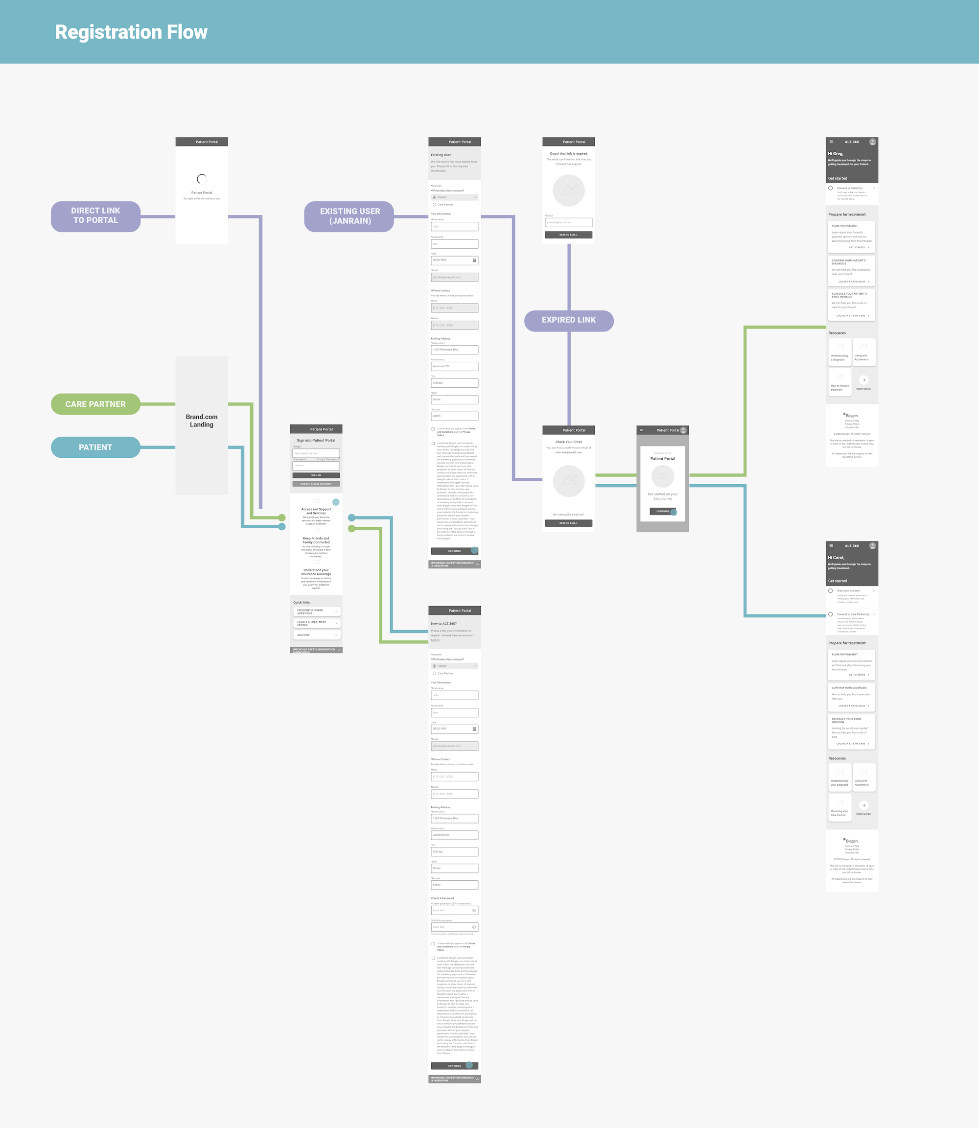
As a primary output from the kickoff workshop, the Golden Path plotted the treatment and product journeys as parallel lines, and provided the springboard for feature and interaction drill downs in the define phase.
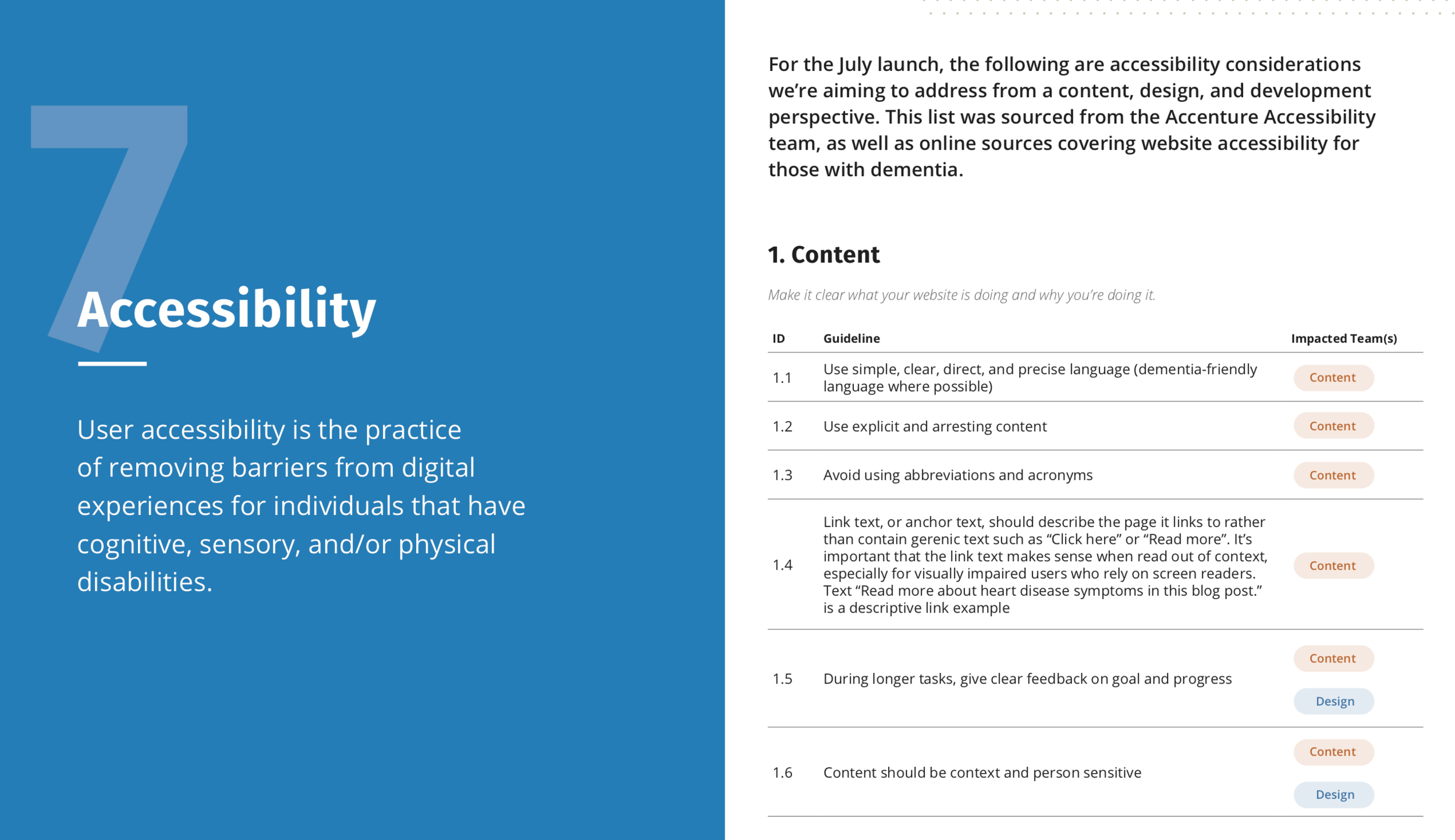
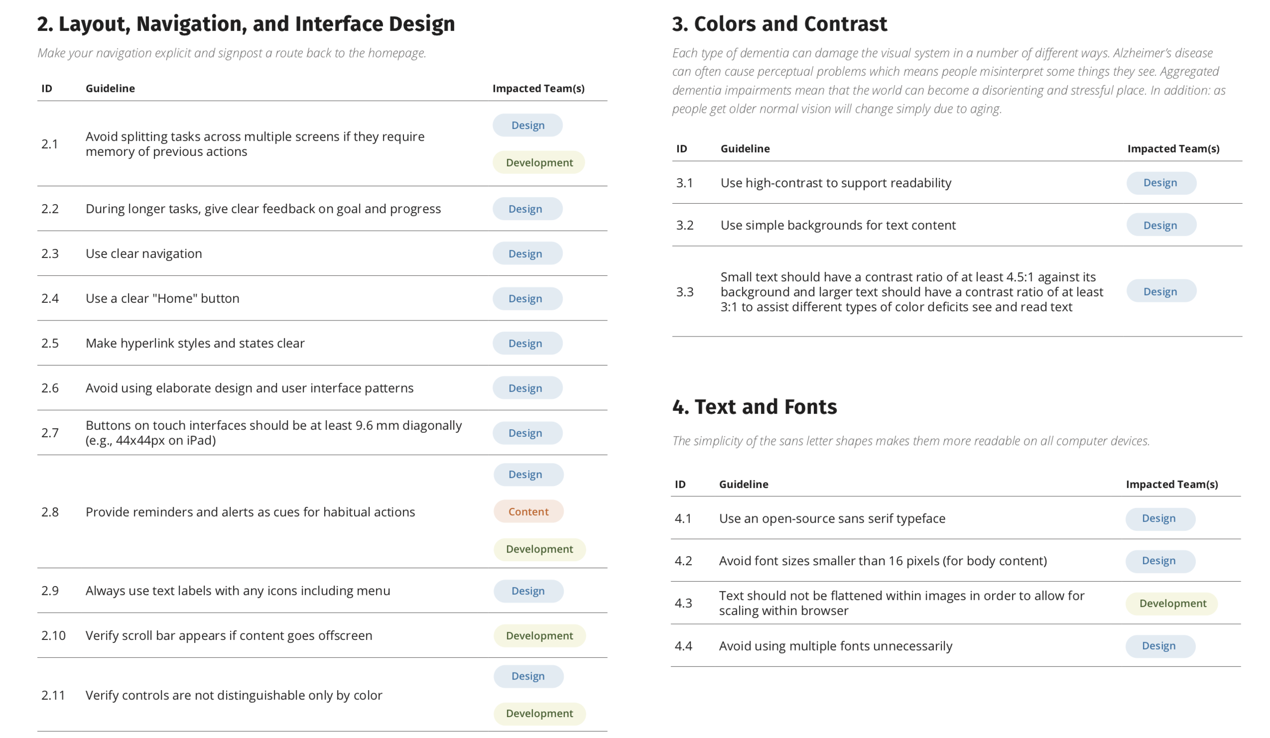
Accessibility guideline alignment
Additionally, I spearheaded the assembly of project accessibility guidelines, collaborating with the international Accenture Accessibility team, as well as gathering research and recommendations from trusted sources on accessibility best practices for users with dementia, including the Alzheimer’s Society.
I completed this work during the discovery phase, ensuring time for alignment across the team (including client stakeholders) and to investigate accessibility features built-in to the platform.
Design and development was to be completed across six sprints. I owned requirements gathering, UX strategy, and functional documentation for roughly half of the core features in scope.
To stay on schedule, my time was limited. I loosely followed the GV Design Sprint process, spending 1-2 days on each of the following steps, repeated for each feature:
Mapping
Reviewing relevant discovery material. Outlining goals, assumptions, risks, dependencies. Convening quick strategy sessions with key stakeholders to ask critical questions and gather business, user, and technical requirements.
Sketching
Starting usually on paper or whiteboard, begin iterative ideation and solutioning. Collaborating closely with the technical team to ensure feasibility. Identifying the strongest ideas to present to the client as low-fidelity wireframes.
Aligning
Presenting wireframes to client stakeholders, leading through design choices and trade offs. Ensuring all requirements are met. Documenting remaining open questions and feedback received.
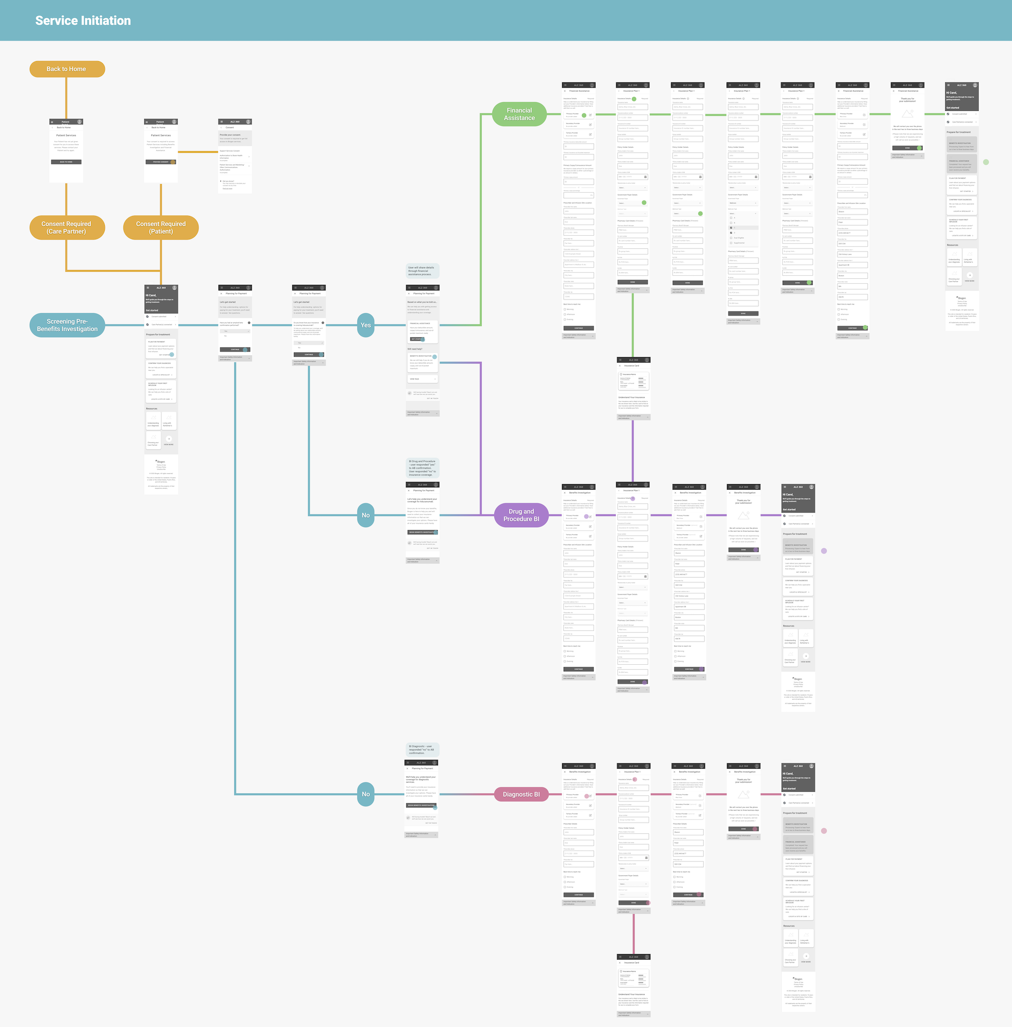
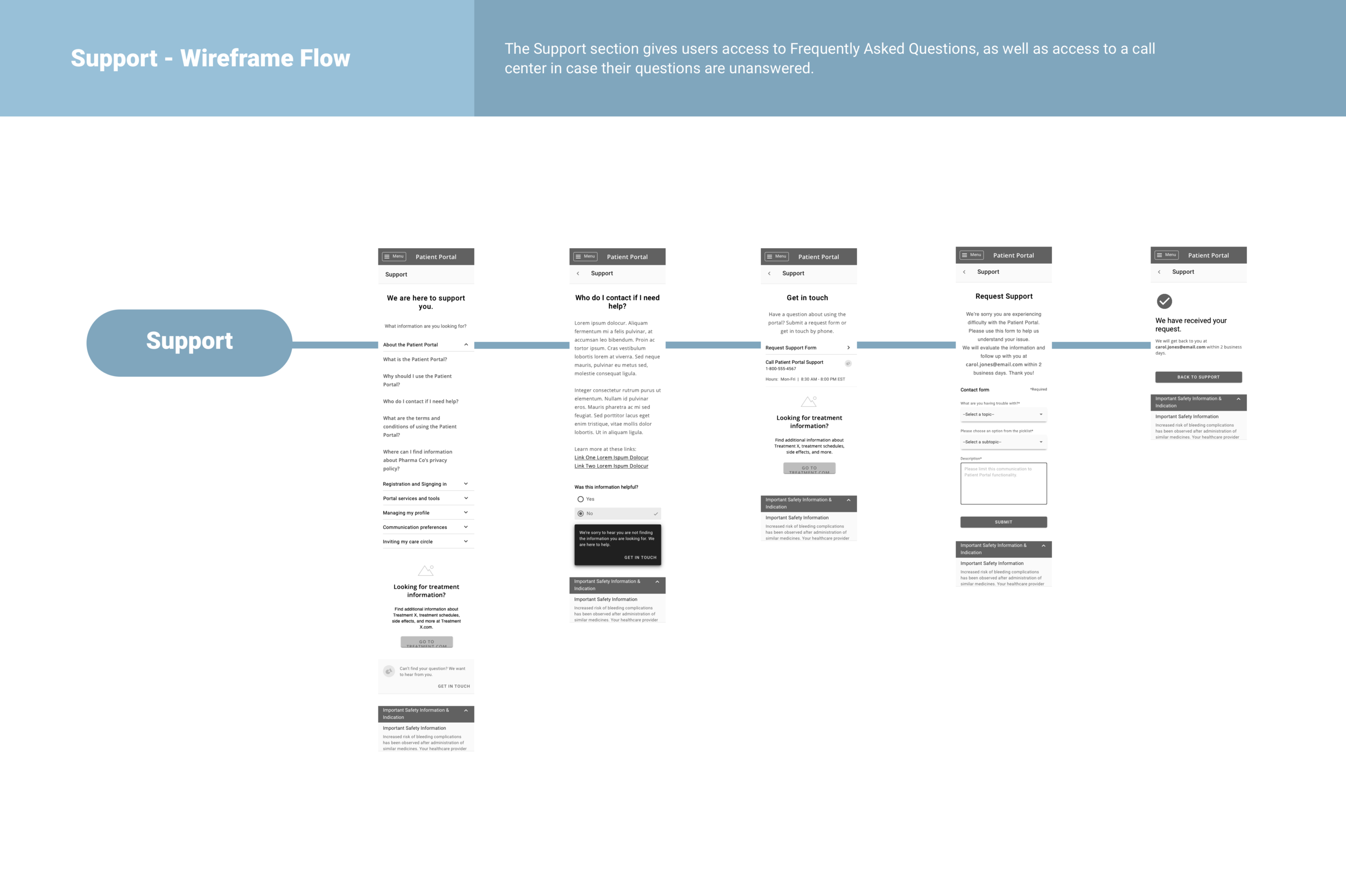
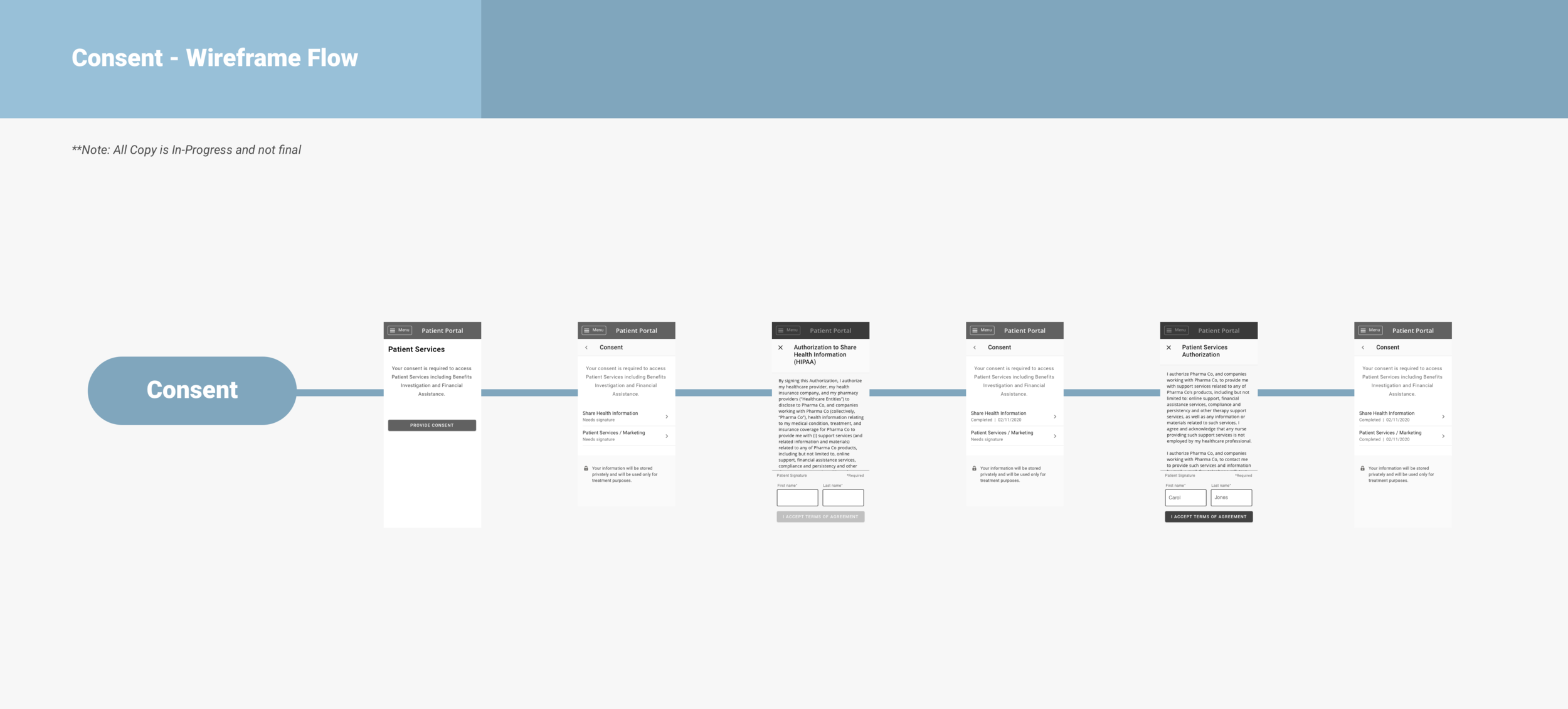
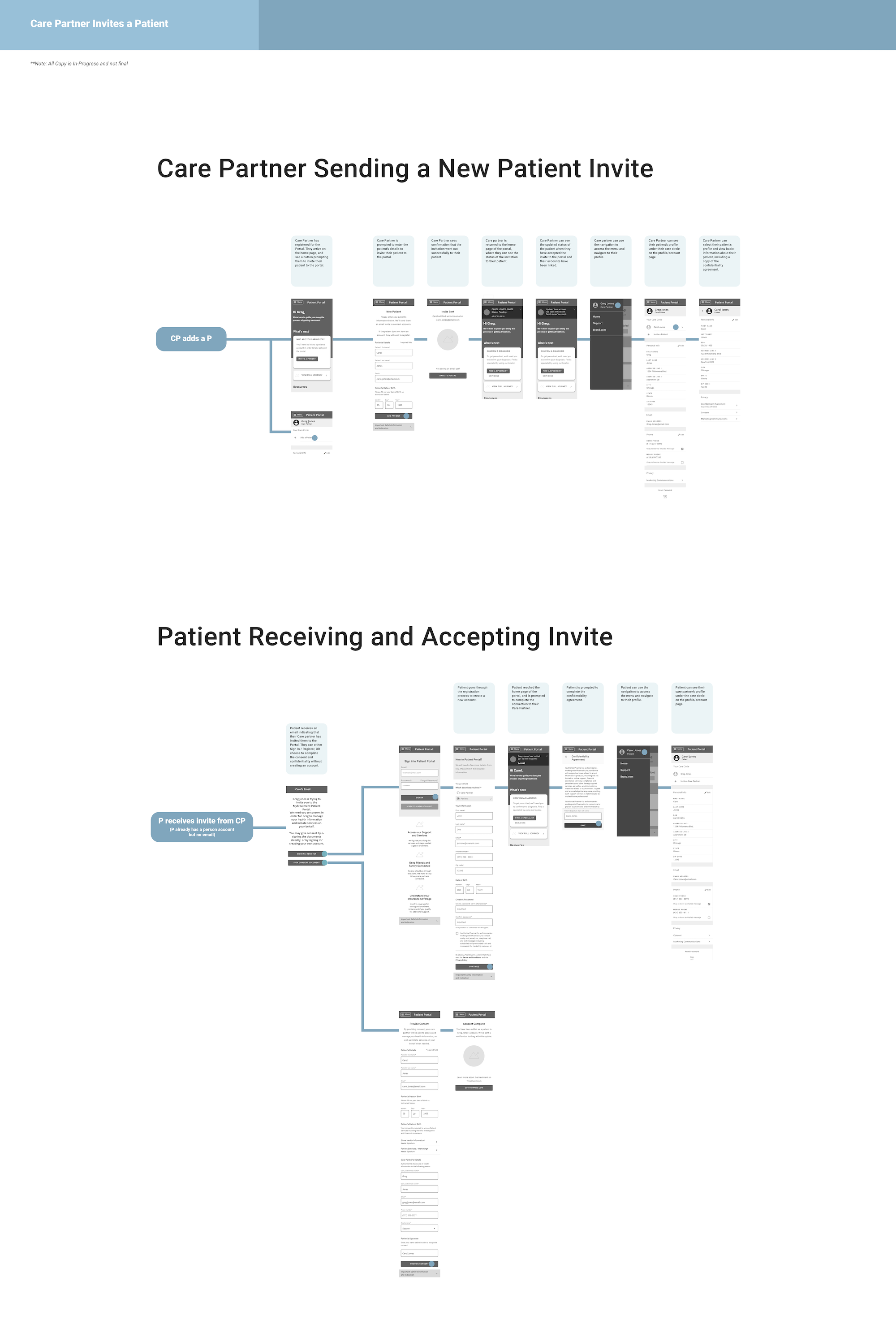
Documenting the flow
Refining wireframes with stakeholder feedback. Digging deeper into interaction level detail, including documentation of all screens, states, alternate paths, edge cases, and error handling.
Despite being unable to accommodate user testing at this stage of the process due to the aggressive timeline, I also began tracking aspects of the experience reliant upon assumptions that would be valuable to test.
Product flow
Even while quickly iterating through micro design details, we worked diligently to stay true to the macro experience goals. The portal was just one piece of a digital ecosystem in development to enable patients to better access and manage treatment. It would be easy to dismiss the pre-portal enrollment treatment website as out of scope and therefore out of mind since was being produced by another vendor.
Instead, despite the added challenge, we took care to understand the holistic experience. The website would be the gateway for most users into the portal. Authenticated or unauthenticated, browsing casually or a returning portal user, the experience should feel cohesive.
We developed a product flow to envision the user’s entire journey, including those pieces of the experience outside of our team’s direct control. By capturing integration points and authentication details, we were able to identify areas that would need extra attention to ensure a seamless experience.
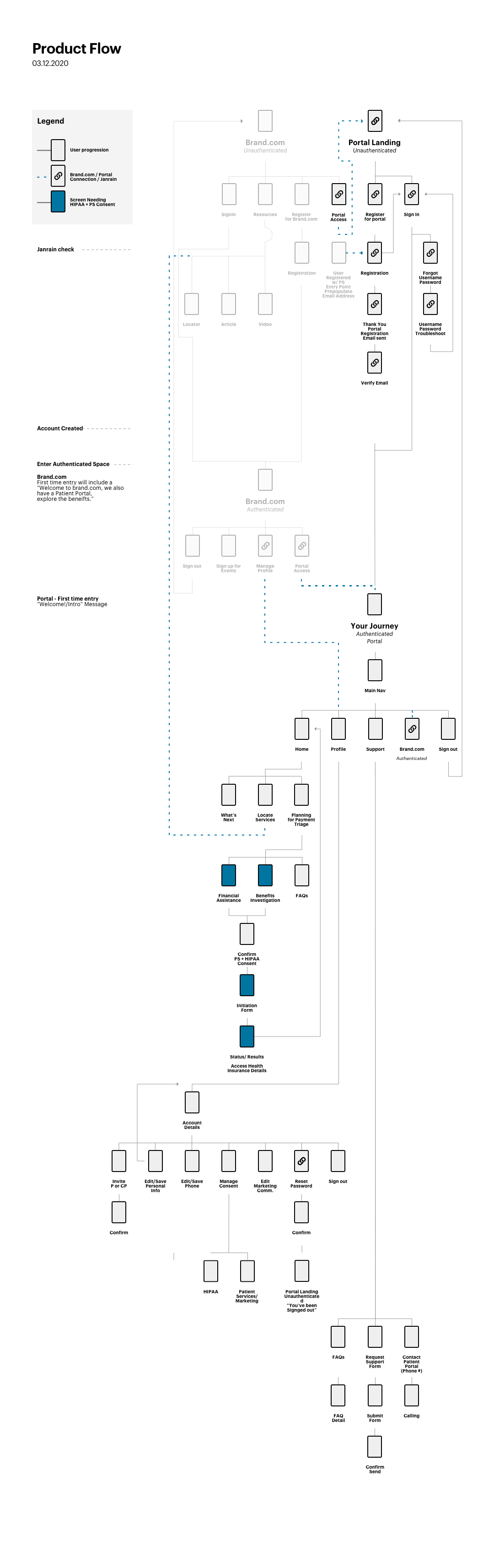
Despite receiving minimal branding guidelines, we set to work applying visual design to the approved wireframes. Working closely with the dev team to ensure feasibility, we took a final pass over all screens and components to distill the experience into a streamlined set of flexible, modular components.
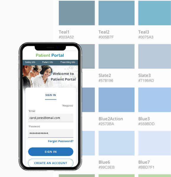
Our design approach
Ensuring consistency with accessibility best practices.
Enabling a fully responsive experience across desktop and mobile devices.
Creating a component library and design style guide to support future product design and development at scale.
I collaborated closely with teammates to ensure we were leveraging Salesforce out of the box components and design patterns and considering platform limitations and dev effort / feasibility as we considered design directions and iterated on styles.
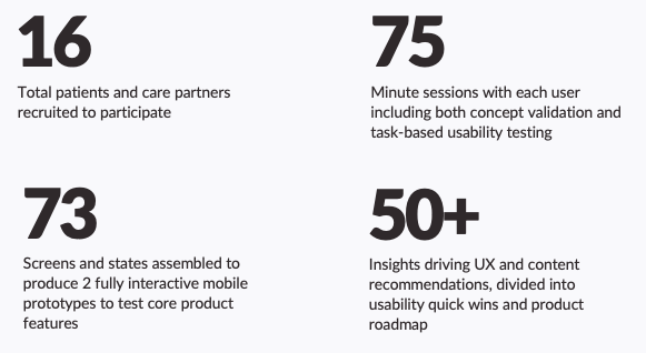
For the final eight weeks of the project, I transitioned to a Research Lead role. I was able to take advantage of my in-depth knowledge of the product design to spearhead a broad usability testing and concept validation initiative that would inform the product roadmap for the second release. Working with a third party vendor (handling user recruitment, onboarding, and testing moderation), I coordinated all other facets of a user testing cycle including identifying aspects and tasks to test, coordinating production of prototypes, documentation and analysis, and communicating findings and recommendations.
Identifying aspects to test
As the product design subject matter expert, I spearheaded the testing team’s efforts to identify the priority aspects to test. I surfaced core features that had assumptions underpinning significant design decisions, which would in turn would have high risk for fallout if those assumptions turned out to be incorrect. Ultimately, we selected four core user flows to test, and I coordinated with the design team to assemble the prototype.
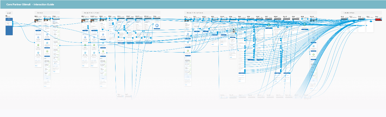
The beautiful chaos created by using the Sketch plugin Craft to prototype.
Static vs. iterative stimuli
Additionally, I worked with the testing team to develop a testing discussion guide and define how to use stimuli to gather both usability and concept validation user data. While the interactive prototype was best suited to collect usability related quantitative data, we also identified a handful of static screens that would be used to gather concept validation related qualitative data, such as:
Capturing user reactions to overall look and feel, copy
Discussing the desirability of concepts or features at a high level
Comparing different versions of screen layouts, messaging, or designs
Reflecting on interaction points (“where would you click to find / do X?”)
Documentation and analysis
I led a lean documentation and analysis process using the Rainbow Spreadsheet as a starting point, which served as our single source of truth throughout the research cycle.
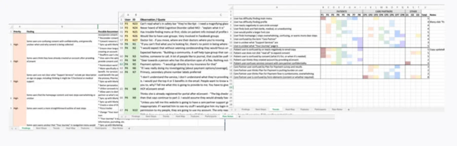
Showing findings/recommendations, raw notes (focused around observations and capturing direct quotes), and observation trend map (from left to right). Image intentionally blurred to preserve client privacy.
I took notes during all 16 sessions, tracking trends and metrics as I went, and communicating suggestions live to the moderator. Contact me for additional sanitized details about the final results of my analysis.
Actionable insights
The testing findings, including bigger picture themes and more granular usability issues, directly informed my UX recommendations. I separated my recommendations into the following categories:
Updates to the design, copy, or strategy
Quick wins (bugs or quick dev fixes)
UX overhauls (longer-term or strategic)
Open items that require additional discovery / further research
I presented findings and recommendations across stakeholder groups and teams to be prioritized. Based on prioritization and timeline, the recommendations were either integrated into the release plan or added to the backlog or roadmap.
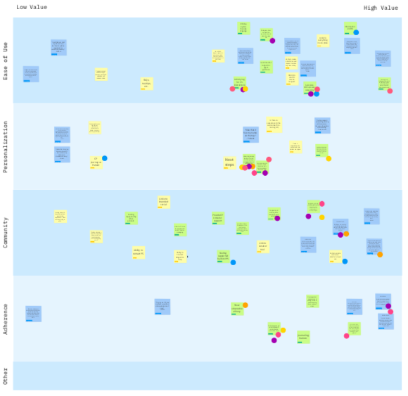
I presented key user testing findings to stakeholders, then used a Miro workshop activity to align the team on how findings related back to core product value drivers. Gaps identified from this analysis drove prioritization for the next release.
The client expects 10,000 patients and caregivers will register for the patient portal in its first year. My research contributions are already steering the roadmap for a second release, focused on enhancing personalization and building more adherence features to make the treatment regimen easier: calendaring, reminders, notifications, and more.
As the only designer on the team with Salesforce platform background, I helped to guide the design team’s iterations and provide guardrails against technical constraints, while still exploring creative solutions. By keeping the design team educated about limitations and opportunities, feasibility reviews with the development team were more efficient, and ultimately, we were able to stay ahead of the fast-paced product implementation sprint cycles and leverage Salesforce native components and functionality to meet user goals.
Following the success of the first research cycle, the client has committed to an even more research-driven approach moving forward. They will use an online user testing platform to conduct lightweight, unmoderated usability testing on features while—rather than after—they are being designed.